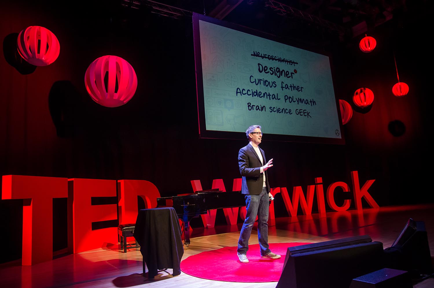
All posts tagged UX

19 Posts

Out of the box UX

Here’s a little known fact about me: I never studied design or multimedia or service design way back when I was a student at university in the noughties. I knew what I wanted to do and be part of (even back then!) and I wanted to learn about design, information architecture (I didn’t call it that back then, I was just fascinated in information delivery and consumption), product design, digital (or multimedia as we called it back before the interweb 1.0 proper) and the users interface with ‘stuff’ because I was always a righter-brainer & rubbish at the good stuff. I was working part-time at a CBT (computer based training) company helping put together training CDRoms (remember them?) for Helicopter Pilots and I was really unimpressed with how bad they were to use (the CBT materials, not the helicopters!) and how bad the graphics were – In todays world we’d call that ‘poor experience’, and so I got myself on the ‘Packaging Design’ course at Bournemouth University. PACKAGING? ARE YOU MENTAL?! A lot of my mates (and colleagues at the CBT company!) thought I was insane doing a degree in Packaging, they thought I’d decided I wanted to design milk-cartons and not carry on doing what I was doing… but here’s the thing, I was doing what I always wanted to do… think about the component parts of all packaging;

  1. Form
  2. Function
  3. Instruction / Product Information
  4. Design / Brand
  5. Fast moving, evolving consumer goods

Sound familiar? Not so skeptical now are you!

It was literally the only course I could find that would teach me everything I wanted to know about design. About the esthetic form of something, the information architecture of something, the design of something that needs to stand out in a crowded aisle, the typographic quality of something (print anybody?), the brand of something, the perishability, materials, mass appeal, recognition, touch… you name it and in those 3 years I learnt the lot. I just did it using the paradigm of cardboard, tetra-pack and plastic. We even covered sales & marketing as part of the course. It was great.

It’s also something I continuously refer too today because it’s even more relevant in towards world. All our UX is just packaged design.

Packaging on a supermarket shelf has less than three seconds to grab the attention of a consumer.

Those three seconds are exceedingly important when you consider that more than 70% of purchasing decisions are made at the shelf. Add to this the fact that supermarkets can contain on average 40,000 packs to choose from, then that pack has got to work hard. It’s the same with websites, apps, digital outdoors etc.

Packaging’s role is threefold:

  1. To sell the product
  2. To protect the content
  3. To facilitate the use of the contents

Ditto, the role of digital is the same. The component parts are the same too;

Graphics

Packaging graphics have more to do than simply look pretty. They must work to cut through the white noise that is the crowded supermarket shelf, and attract a potential buyer.

Shape

Packaging comes in all shapes and sizes. The structure of a pack can serve to create shelf standout and sell the product, to prolong the life of the product and to facilitate the use of the product. There’s also a lot we can learn from packaging that ‘just is’. It’s practical & boring in some cases, but absolutely necessary to transport the precious cargo to the end user.

Sustainability

The packaging industry has been vilified over the years, not least on the subject of plastic bags. Yet, brands have always been looking for ways to reduce materials and maximise packaging for both environmental and financial reasons. Web optimisation in UX is the same.

Materials

Traditionally certain materials have been associated with certain markets. But as markets change and consumer attitudes adjust it is unsurprising that material choice has also changed in the packaging sector accordingly. Same in digital, only our material is now ‘content’ and ‘conversations’ and bits of media.

Regulations

The packaging industry spans many markets and so is regulated by many different forms of legislation and voluntary codes. More parallels – I work a lot in Financial Services so I know this all too well.

Golden Rules

There are 8 golden rules of packaging design that we were taught at uni too that I stilI also apply in UX:

  1. Conduct a thorough audit of all competitors in your market before you start, and make sure you understand their respective positionings and attributes. Then create your own.
  2. Look at what is happening in other markets, e.g. if you are just considering the UK or Europe, what is happening in the US or Far East that might give you a point of difference?
  3. Put measures in place at the start so you can track and learn as you go, e.g. measure awareness of and attitude to your packaging now and in the future. A good research agency will tell you how to do this.
  4. Be different and ensure your pack has its own visual equity and has a strong personality and attitude.
  5. Make sure your pack works at all stages of its life cycle, from leaving the factory to ending up in the user’s hands.
  6. Mock up how your pack would look alongside your competition. Test it in store and make sure it really does leap out at point of purchase.
  7. Design with tomorrow in mind. Create a pack that is in keeping with current market trends and future trends.
  8. Consider doing some pre-market testing to make sure your pack will find a willing audience. But be careful how you test it as consumers never quite know what they are looking for until someone shows them something new. Henry Ford once said: ‘If I’d listened to what people wanted I’d have built a faster horse!’

Out of the box UX

Everybody in the field of UX should be digesting and using content and background materials from the field of Packaging Design. It’s a rich seam of knowledge that can be directly applied to what we do. Take a website for example, it’s just in many cases a fast-moving-consumer-good and it comes with all of the same elements. Now that interfaces are merging with the real world it’s more relevant than ever.

2013 is the year where I go right back to my roots and start to bring packaging to the forefront of the area of UX that I work with. I’m going to start taking packaging examples to client meetings & as part of all my Discover, Define, Design phases. It’s actually one of the single biggest areas of parallel comparative research available to us so when you start a new brief this year, make an effort to go down to the supermarket & decide what kind of package your making for your digital content.

Resources

How excited am I?!

I’m not late to this party. I saw this when it first landed last month. What I have been doing is studying it… and quite intently… because from what I’m seeing ‘IF’ this is the experience they’re going to go live with and it’s not just a really polished up demo video (we’ve all done it to sell something, it’s what Computer Games have been doing with their advertising for decades; “Not actual game footage”) then this could be potentially game changing. Not just for social networks, but for the way we design our websites.

So what about it then? It’s an important piece of design because it’s gone balls out to be awesome. Which means no compromises. It means giving people the time and the bandwidth to do something amazing. Working within those variables inevitably means great (no, AMAZING) work emerges. All too often as UX practitioners we’re given the brief, but we’re not given the time or budgets to do the brief justice. A deadline dictates the output. The budget dictates the deadline. The competition / competitors dictate the deadline. What we end up with is work that quite often we are not happy with and that shows in the output. I believe that.

So just do what I’ve done for a while now and go over this video again and again and again and absorb the quality of the interaction design. The dedication to the experience design. The attitude of the team (which this oozes by the way – ATTITUDE – the attitude to want to produce the greatest interaction experience on the internet… it smells of hunger and want, doesn’t it?!) to win.

In four words: “I already love it“.

The UX of Visualising Data

Introduction – Visualizing the abstract

I’ve been working on  a project over the last couple of months that’s opened my mind to a whole new place in UX that I’ve fallen deeply in love with. It’s always been there and I’ve always admired it, but I’ve never had to interact with it first hand and given it much studying until now. The area of Data Visualisation or InfoViz as I’ve been calling it with my clients.

I’ve got some new heroes in the form of Hans Rosling and David McCandless. Men who not only do the visual part, but have become voices that help articulate the importance of visualising data in ways that the normal user can consume. I love that quality in people.

By visualizing information, we turn it into a landscape that you can explore with your eyes, a sort of information map. And when you’re lost in information, an information map is kind of useful. We should allow the dataset to change our mindset and if we can do that, then maybe it can also change behavior. It’s a fascinating area.

David McCandless in one of his Ted Talks said the following; “We’re suffering from information overload and data glut. We need to help visualize information, so that we can see the patterns and connections that matter and then design that information so it makes more sense, or it tells a story, or allows us to focus only on the information.” Never truer words spoken about ANYTHING we do in UX, not just InfoViz.

Data is the new oil?

Lots of wonderful comparisons to natural resources when I having my adventures round data land. If data is the kind of ubiquitous resource that we can mine and can shape to provide new innovations and new insights, and it’s all around us, and it can be mined very easily if we set our UX up to gather and harvest at the right times.

Graphis diagrams: The graphic visualization of abstract data

I recently found out about this book by Walter Herdeg, which is truly a great great thing if you can actually find a copy of it. The original was published in 1974 but still has some genius to it and the v.2 book is also full of thoughtful quality. A seminal vision for the convergence of aesthetics and information value, which codified the conventions of contemporary data visualization and information design. One of the 100 most influential design books of the past 100 years, it features work by icons like legendary designer and animator Saul Bass, Brain Pickings favorite Milton Glaser, TED founder Richard Saul Wurman and many more.

For instance, check out this beauty:

Examples

During my exploration for this project I’m working on I’ve stumbled upon a whole wealth of amazing InfoViz and I wanted to share my favorites with you so you can marvel at the Data, but also at the incredible Interaction Design and Visual Design that go into making InfoViz so magical.

Four Ways to Slice Obama’s 2013 Budget Proposal

With Obama’s recent budget for next year proposed, Shan Carter et. al of The New York Times let you explore the plan in their new interactive graphic. It provides four distinct views of what the breakdowns look like, all the while keeping a distinct link between each click with smooth transitions and consistent objects. The transitions make this graphic. It’s often useful to see data from different angles, and the smooth transitions (rather than abrupt jumps) let you see how things are and how they have changed, effectively. This is fine work. Click here to check it out in all its interactive glory.

The London Riots from The Guardian

The Guardian newspaper in the UK are the bonafide gurus in visualizing news information. Here are two amazing examples from the same news topic – The London Riots – and both prove just how incredibly talented the Guardian designers and InfoViz experts are + just how fascinating some of the data from the London Riots is.

The shooting of Mark Duggan on 4 August sparked a series of riots, first in Tottenham then across England. This timeline was created to follow the spread in interactive realtime, culminating in what could be the most incredible catalog of an even ever put into digital form. Their version of it for the Arab Springs was similarly fascinating and groundbreaking!

It’s both Visual and Visceral. Articulating time as a road is very clever and breaking events across the timeline by location is equally captivating. Massive kudos indeed – Click here to go have a fiddle and marvel at this one.

However… it wasn’t the jewel in the interactive InfoViz crown for the Guardian. Oh no… they kept that back for this:

The analysis of 2.6 million tweets shows Twitter is adept at correcting misinformation – particularly if the claim is that a tiger is on the loose in Primrose Hill and that’s exactly what they did with this amazing info t0ol:

Throughout the UK riots, many scanned the internet in search of reliable information. In the absence of confirmed news, the web was often the only way of tracking events. Amidst the hubbub, countless topics came and went. As worries mounted, speculation grew. Rare individuals requested sources, countered hearsay, sought the truth. The rise and fall of rumours on Twitter is a striking display of social forces in action. Click here to have a play, it’s really quite a breathtaking thing they’ve created.

Rethinking the food nutrition label

The food nutrition label is on almost every food item, but it can be confusing in the sense that it doesn’t tell you much about whether something is good or bad for you. The UC Berkeley School of Journalism hosted a challenge for designers and food experts to rethink the label.

We are confused about what and how to eat and so we’re eating too much of the wrong things. In fact, we’re eating too much of everything. Two-thirds of American adults are overweight or obese. The obesity rate among preschoolers has doubled since 1970. Type 2 diabetes has become an epidemic. We want to make it easier to choose healthy food.

Visual designer Renee Walker won with her rework shown above. The rectangles on top of each label represent main ingredients, and bars on the bottom provide a quick thumbs or thumbs down for a breakdown of fat content, carbohydrates, etc. Icons of spoons and scoops are used to supplement serving size since no one knows what 182 grams looks or feels like. Click here to find out more.

 Electricity Generated from Renewable Sources

I really enjoyed the simplicity and fluidness of this one. It’s basically a breakdown of energy consumption by country, by year. Simples. Check it out. This is the kind of thing that would normally be shown to the consumer as a table of data, or a bar chart. It’s a much more engaging experience when you can reach out and touch the data. Brilliant.

If you liked that one you might also like this one from the U.S, which is Your Electricity Bill redefined.

Political Climate Chart

Another great example of how to break 3 dimensions down into one clean interaction. Time, Issues & Political Party. The norm’ would be to add things onto a bar-chart or similar. This way we get something much more fun and something much easier to digest. Click here and have a go yourself. Some fascinating data.

Here’s another two from the U.S that give us interactive views of similar data scenarios. What a “Hundred Million Calls to 311 Reveal About New York” and the “US Health Care Spending: Who Pays?” breakdown.


Sources & great references

I’ve browsed A LOT of great resources recently and digested a lot of great InfoViz… here are some of the sources I’d recommend if you’re starting to fall in love with Data like I have:

Cartophile Cartographia
Chartsbin Chartporn
Cool Infographics Comicbook Cartography
Daily Infographic Daily Statistic
Data Visualization Everyday Venn
iGraphics Explained iLove Charts
This Is Indexed Information Design
InfoGraphic Directory Infographic Site
Info Graphic World Info Graphics News
Infograph Love Infosthetics
Information Is Beautiful Junk Charts
Flowing Data Fuck Yeah Visual Data
Mind Map Art Neoman Infographics
News Graphics Old Map
One More Graphic PD Viz
Social Media Graphics Mega Maps
Infographic Showcase Visualsing Data
Vizualize Viz World
Well Formed Data

UX Prestige

Every great magic trick consists of three parts or acts. The first part is called “The Pledge”. The magician shows you something ordinary: a deck of cards, a bird or a man. He shows you this object. Perhaps he asks you to inspect it to see if it is indeed real, unaltered, normal. But of course… it probably isn’t. The second act is called “The Turn”. The magician takes the ordinary something and makes it do something extraordinary. Now you’re looking for the secret… but you won’t find it, because of course you’re not really looking. You don’t really want to know. You want to be fooled. But you wouldn’t clap yet. Because making something disappear isn’t enough; you have to bring it back. That’s why every magic trick has a third act, the hardest part, the part we call “The Prestige”.

I’ve started to think about this a lot recently – Process – that fallen tree on the path to the Emerald City. I think we’ve over-compicated it. Let’s pull delivery down to an essence, call it Lean or whatever you want, it’s just 3 simple phases to fix a problem:

Discover Define Design
Magic The Pledge The Turn The Prestige
Advertising The Insight The Concept The Solution
Client Business Objectives Customer / User Need Technical Requirements
Agency Quantitative
Qualitative
Desk Research
Ethnographic Observation
Mental Model
Experience Design / Map
Strategic Response
Skeleton / Structure
Sketch / Wireframe / Patterns
Tech / Prototype / POC
Final Screen Designs
Content / Taxonomy

Remember that UX is just the focus… a thread that runs through all of our disciplines, and which no single discipline owns (Nick Fink).

Now… before you all go batty and start bashing me. Know this. I ‘get’ that the above table isn’t exhaustive and there’s a ton of other big and little things that we could be doing, but if we strip all the noise & delivery back to simplicity then why not just offer 3 phases and 9-12 deliverables (we’d never do all the Discover stuff, right?!). I’m sure it’d be easier for clients to digest.

Banks. Atomic Units. Apathy. UX.

From my recent lecture entitled ‘Banks and the Atomic Unit’:

My UX Book List – Essential Reading

I’m not a massive reader of books to do with work, if I’m honest. I prefer to sit down and read a tome that takes my mind off of work and I’m one of those UX’y people who generally prefers to learn by my past mistakes and other peoples actual work. Plus if it ain’t on Kindle then chances are I won’t read it these days. That said, I do have a set of books on my shelf that I’ve bought, been given, borrowed and forgot to return that cover lots of different angles of UX, Design, Marketing, Social and all those other bits I tinker with.

Obviously this list is mine and might not float your boat because of our different experience with scientific research methods, psychology, interaction design, user interface design, product or visual design and our levels of communication skill, but if you’re a voyeur you might like to have a look at my bookshelf.

So here is a list of books I would pick as the must read UX books.

Generalist books that I urge you to check out

The UX Book List

The Infographic Book List

Its by no means exhaustive and I’ll endeavor to add some more to it. But it’s the stuff on my shelf and I use them as references in much of what I do. Enjoy.

10 really neat experience principals

Found these little beauties nestled in a Seminar Summary from 2002 no less… Probably baffled the hell out people 10 years ago (say that out loud – I said 10 years ago, they’re a decade old – Scary!) but I would say they actually hold a lot of truth and value in todays digital era:

They’re from the book The Ten Demandments for turning the most demanding consumers into the most delighted customers. Rules to Live By in the Age of the Demanding Customer by Kelly Mooney.

  1. Let me do things
    • As I move through the experience, let me do things that change the resulting display in a way that feels as though it has been designed for me personally, in my context. Move beyond mere viewing.
  2. Let me win
    • Reward me every time I accomplish something. Make the experience transparent so that the structure, operation and purpose of the experience is comprehensible and valued.
  3. Push me
    • Help me reveal my potential; don’t let me “get by.” Help me visualize what I want to accomplish, so I can plan what I want to do next.
  4. Help me learn
    • Combine doing with understanding. Let us learn from each other…and from the web of connection.
  5. Sense and respond
    • Let me customize while you dynamically personalize for me. Make me feel like the artifact is alive and aware of my needs. Think of responsiveness by time, format, form and structure and quality of response.
  6. Orienteer
    • Give me a journey that I can take and tasks that I can do. Don’t steer, just give me a map to keep me located. Show me what and who’s interested so I can direct my participation effectively.
  7. Outfit me
    • Deliver new capabilities and make it easy for this to become a part of my life while skilling me.
  8. Connect me
    • Help me make connections with the subject matter, or across destinations, or with other people.
  9. Immerse me
    • Plunge me into the experience in a way that makes me even less (or even un-) aware of the place or setting that I’ve come from.
  10. Make waves
    • Engage me in co-discovery and co-creation and transform my life, my work, my business.

Original source: http://www.humancentereddesign.org/webconference/jf_se_outline.php

Gonzo UX

Work that researches well is predicted on what has gone before. Anything different, or out of the ordinary, will test badly, for the very reason that it is different – Bill Bembach

The majority of my work is as it should be… Neat, proper, rule-abiding and by the New Rider book. Packed full of user-centred design and interaction principals. The user at the heart of the story just happens to be me. Occasionally I need to indulge myself and that’s when my work gets all a bit ‘Gonzo’.

Maybe I’m wrong, but is it time for us to embrace ‘Gonzo UX’ as a reality of our industry and recognise it for right or wrong as a reality, because as a tool for the current generation of UXers’ who go to work everyday & follow the ‘rules’ but don’t always necessarily believe those rules it’s part of our lives and so many of us with a slight right-brain skew do it. I’m Gonzo and proud.

We pay lip-service to the methods of UX for the sake of our clients and then just do our own thing alot of the time. Exaggerating things to make them cooler & more progressive. We do our UX with claims of objectivity, but really how objective is it once we’ve put our own spin on the results, ignored the average bits of the insight and just pushed things forward rather than to the side – which to be honest is what the passionate few amongst us really want. If you’re not being Gonzo for some briefs then you’re not innovating, you’re optimising.

I almost always end up including a little piece of myself in the story, concocting a solution with me as the protagonist thinking “I’ll call the persona Gerald, they’ll never notice that crafty 30 something advertising exec from London is really me”… Come on, admit it, how many have you have done it?! More than you’d think. So much of what we do is a subjective, artistic endeavour based on our own objectively collected insights as real life consumers. We’re just scared to admit it because we think it somehow cheapens the solutions and the work is less robust because there’s a large wedge of ourselves in it rather than a real-life bloke called Gerald who probably still owns a monotone Nokia from 2003 anyway… And I’m certainly not user-centring a solution around THAT bloke, he sucks! When that proposal goes live deep-down its somewhere comfortably between subjective and objective and as long as it’s still good, where’s the harm in being a bit Gonzo with the approach. It’s still packed full of insight driven work, the insight just happens to be your own. It’s good. It has a place and you shouldn’t be ashamed (as long as you’re racking up success and you can attribute it back to some fuzzy bit of research or insight someone pompous researcher gave you at work).

Lets look at bit more at the detail. Gonzo UX tends to favor style over fact to achieve accuracy — if accuracy is in fact meant to be achieved at all — because we often use our own personal experiences and emotions to provide context for the topic or solution being covered. It disregards the “polished”, edited solution favoured by the esoteric usability cronies and strives for a more gritty, personable approach. Sometimes you see the personality of a solution is just as important as the problem the solution is trying to fix.

If you have a tendency when you’re selling solutions in to use quotations, sarcasm, humor, exaggeration, and profanity then you may in fact be practising Gonzo UX and you don’t even know it.

So as of today I’m actually adding ‘Gonzo UX’ to our companies list of approaches. As a term, for our clients, and I’m going to make sure our team are proud to do it when the time is appropriate.

“What? The client won’t pay for research and insight?” It’s a Gonzo solution.

“Oh my god, that insight work sucks but I’ve only got 2 days to craft a response!” It’s a Gonzo solution.

“This project is just going to be DULL and UNINSPIRING if I follow this research and tailor it to this dudettes life” I’ll go a little bit Gonzo for the sake of making it good rather than average.

The Crazies

Remember the Apple Think Different campaign? Seeing as how there’s been a few references to Steve Jobs and Jonny Ives (strategist / tactician and a designer working in harmony anyone?) recently I thought I’d just surface my favourite advert of all time:

Here’s to the crazy ones. The misfits. The rebels. The troublemakers. The round pegs in the square holes.

The ones who see things differently. They’re not fond of rules. And they have no respect for the status quo.

You can quote them, disagree with them, glorify or vilify them.

About the only thing you can’t do is ignore them.

Because they change things. They invent. They imagine. They heal. They explore. They create. They inspire. They push the human race forward.

Maybe they have to be crazy.

How else can you stare at an empty canvas and see a work of art? Or sit in silence and hear a song that’s never been written? Or gaze at a red planet and see a laboratory on wheels?

We make tools for these kinds of people.

While some see them as the crazy ones, we see genius.

Because the people who are crazy enough to think they can change the world, are the ones who do.”

It’s a beautiful piece of poetry by two incredibly talented wordsmiths Rob Siltanen and Ken Segall from Chiat Day. I was lucky enough to visit and work at Chiat Day in LA back in 2008 and it reminded me why I love what I do. Meeting someone as industry defining as Lee Clow was humbling and a grounding experience. These guys make things simple. They’re designers of words and thoughts and they make it approachable and elegant and I think we as UX tradesman and women can learn a lot from that.

Keynote Kung-Fu: How to wireframe like a ninja

Travis Isaacs is a visual/interaction designer and front-end developer. He created the Keynote Wireframe Toolkit which you can download at http://keynotekungfu.com

I love this presentation… it’s so true:

open